Sunday, 8 May 2011

first door model

To start off I began with a vertical rectangular shape for the door and beveled the two top corner and moved the offset the its maximum which rounded the top of the mesh into a curve which it then looked something like this,


after then doing this I created a thin square that was to be the wall for the door. I duplicated the door to be safe so that if anything happens the original mesh is still intact.
I expanded the width between the front and back face of the door copy then moved the bottom edges of the mesh so there was alot of registered space between the walls and the door so I could use it as a boolean so the door could fit inside the wall.... after using the boolean tool the copy of the door disappeared so it was good I duplicated it otherwise the original mesh would be gone.


once done the basic shape looked something like this


Saturday, 7 May 2011

concept artwork to start initiative process

My thoughts are to try and model the door on the top left because I've not had much experience with modeling so I think it will be simple to start with 

Tuesday, 5 April 2011

References for the Door

Here are some pictures I found while searching google. These are for some quick starting points that can be developed to create my own door.


while on a journey surfing the net I have to say the metal swans that are joint to this door inspired my to think about maybe putting that little bit extra into sculpting on my door. This brought a image up in my head of a metal lions head with the ring for a door knocker in its mouth, maybe with some tests once my door is finished in maya I could try and sculpt this idea; would be difficult... but I'm up to the test.


Although! Im not very familiar with modeling so I have decided to go with something simple to start with, the door above is my first line of inspiration for now. I will come back to the other door shown further above.

Wednesday, 30 March 2011

3D Modeling

For this project we are making a door that can be imported into a game engine.
For my door I've decided to reference so that it can become accurate to real life structure; the doors I will be looking at are possibly church or cathedral doors because i love the old wooden texture that they behold so I can see painting this texture could be alot of fun, but I will see how it goes and how it turns out.

Monday, 28 February 2011

digital sculpture

i know i shouldnt of gone over the top with painting and textures but i got too carried away and wanted to
see how far i could get with using mudbox for my 3rd time

3rd life drawing class and other walk in life drawing

Im very please with how the female drawings came out in this, I do believe im gradually improving with my life drawing.


Final 3D animation

i spent alot of time and effect into this piece of work I really hope it was worth the hours...weeks even

Sunday, 27 February 2011

3D animation

   With 3D animation models are created and rigged for a animator to animate.

   To start with a model is made and built up from scratch with polygons in a 3D modeling program for example maya. The model if to say it was a human like character it would have individual parts for limbs that need to be rigged and also anything else that needs to produce movement. These parts are rigged with joints and a skeleton so the model can contain any sort of motion that can be made.
Once done the animator then focuses on making the model move as realistically as possible/or to just have a very smooth animation.

   3D animation you cant just start where you like because you must literally bring your character to life first before you can actually accomplish your goal.

2nd life drawing class


worked really quickly in this lesson spent small amount of minutes on the drawings so we were just trying to capture the value of body shape

2D Ball animations

First attempted at 2D animation on photoshop, was quite messy but i followed through and completed the task

2D animation

   Movement is created by objects being created or edited on computer software. The software orders the frames automatically meaning you can press play and the animation is in sequence and will be generated at fps.

   On the other hand there is also a way to generate motion by not using computer software at all. This is called a flipbook, a traditional way of animation populated in the 19th century of which the device was invented. A flipbook is basically a hand drawn animation set to be at the side or corner of a page inside a book so that multiple drawings can be drawn on each page but placed in roughly the same place on each page, so when you flick through the pages each drawing gives the illusion of movement.

   2D animation is easier to get started but tough to get precise and accurate outcomes because of having to have a good hand to steadily redraw each image accurately to the previous.

researching animation: animation itself

Animation is a rapid display of a number of images of a 2D or 3D format, this could be artwork or rigged models; positioned in a order to create the vision of movement.
The causes a optical illusion to the human eye by how fast each image is being shown due to the frame rate whether this is 10 fps or 24 fps. Obviously 24 fps is more of a believable and smoother because more images are being shown in each second.

   Examples of early animation are set to be approximately 4000 years ago to the egyptians; images of 2 wrestlers fighting, even thought its not being shown as a sequence it still identifies the movement in a superimposed format. 

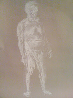
First day of life drawing


First day of life drawing i think it went quite well considering Im not used to drawing the human figure because my technique of drawing is more towards the environment style from being very messy with construction lines but with environment it blends with the technique but for anatomy I think it ruins the structure.

Saturday, 8 January 2011

12 principle of animation in Toy story


Staging


to


The time above will show a idea of which buzz first releases his wings giving the expression he can fly. From the dialogue on the time shown will explain how there is a argument about how buzz can't fly, but by pressing the red button the release his wings opens up a path to a new idea.

Timing and Motion


to


I thought this scene could be classed as timing and motion because its showing that the post has a greater mass than buzz from showing the audience he is able to climb it and the bed post supporting his weight for him to prepare for his action.

Anticipation


to


Here you see buzz preparing for his action (jump) to fly. To Infinity.... And Beyond!!!

Squash and stretch


or


There are two points of squash and stretch in this sequence I have chosen. The first is Buzz leaping from the bed post to jump in which he has to bend his knees and push using his legs to perform this action, and the other is when Buzz fails to fly so he falls and rebounds of a ball on the floor near the bed post. The ball has to squash from absorb the weight of Buzz but also has to stretch back to its former shape caused by the compressed air inside, the force from the compressed air inside the ball then pushes Buzz into the air.

Secondary action and Follow through
and over lapping action


This is the beginning of a secondary action, which is after when Buzz gets bounced into the air by the ball on the floor. From this you see the ball has given Buzz the momentum to land onto the toy car and carry on traveling down the cars ramp.
This can be also class as the cancelation of one action to the other; Buzz jumping off the bedpost and bouncing off the ball. As Buzz hits the peak of the bounce and begins to come down to land on the toy car this is one action canceling and leading on to another because the bounce off of the ball has caused Buzz to land onto the toy car.

Appeal and
 Exaggeration


This scene I thought was good to choose for appeal because its trying to put you in the drivers seat; creating the effect of you traveling as fast as Buzz Lightyear. On the other hand this could be signs of exaggeration from the speed Buzz is gaining as he rides the hot wheels loop. My opinion on how fast Buzz is traveling is that it has been sped up to make it seem he is moving faster than what it would be in real life.

Slow in and out


If you watch the toys move you can see that they are animated in a way that makes them look like they move like humans but are restricted from certain movements because of being toys; they aren't as flexible as human beings so their anatomy is limited to a few joints for motion to connect.


Arcs

In the animation there is a walk cycle of Buzz walking towards the bedpost, so from my thoughts I think this piece of animation shows clear paths of action and also just from looking at the toy's movements there is a sense of realism present from graphics or smooth motion even if it is fictional.


Here is a walk cycle from the animation, I think it has a good resemblance to a the nature walk cycle of a human being if it was on a bouncy surface.


Solid Drawing

I looked at the composition of the animation and yes the characters are small to the size of the scenery. This is obviously to show the scale of the toys and how being small in human surrounding has a effect on them. Also objects that come to be of use to the toys are things human beings would be using, but in the toys perspective the objects scale is multiplied to be bigger for the toys this could make the objects be of a different use instead of what they are originally used for.
   Furthermore the positioning of the camera has a effect on the scale of the toys because it is zoomed in to give the illusion the toys are human size, but the scenery and objects say otherwise.


Animation

12 principles of Animation

1.             Squash and Stretch - defining the rigidity and mass of an object by distorting its shape during an action

2.             Timing and Motion  - spacing actions to define the weight and size of objects and the personality of characters

3.             Anticipation  - the preparation for an action

4.             Staging - presenting an idea so that it is unmistakably clear

5.             Follow Through and Overlapping Action - the termination of an action and establishing its relationship to the next action

6.             Straight Ahead Action and Pose-to-Pose Action - The two contrasting approaches to the creation of movement

7.             Slow In and Out - the spacing of the in-between frames to achieve subtlety of timing and movement

8.             Arcs - the visual path of action for natural movement

9.             Exaggeration - Accentuating the essence of an idea via the design and the action

10.           Secondary Action - the action of an object resulting from another action

11.           Appeal  - creating a design or an action that the audience enjoys watching

12.           Personality - in character animation is the goal of all of the above